
Return to blogs
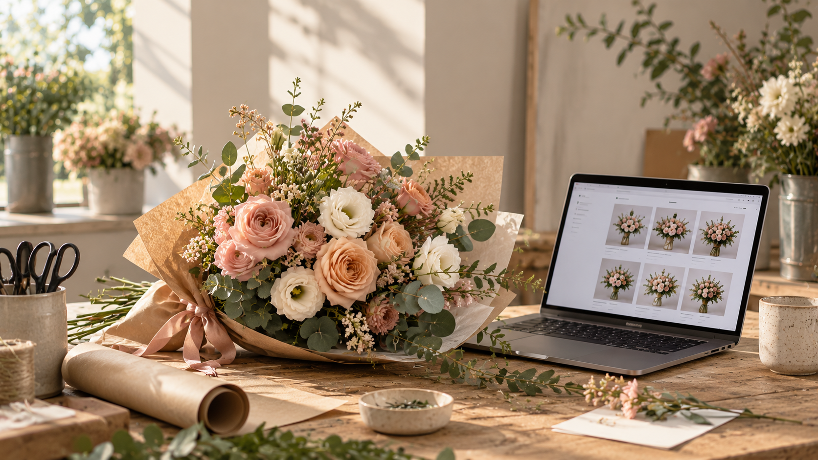
In a flower shop, customers can walk in, admire the arrangements, ask questions and get a sense of the size and quality of a bouquet before buying. Online, they have to make those decisions from a screen.
For florists, that makes the product page one of the most important parts of the shopping experience. A beautiful photograph might catch someone's attention, but clear descriptions, realistic images and useful product information help them decide whether to place an order.
Getting these details right doesn't necessarily require an expensive photography setup or a complete website redesign. It starts with understanding what customers need to see and know before they buy.
Good florist product photography should give customers a clear idea of the arrangement they're purchasing. A close-up of beautiful roses might look impressive, but it won't necessarily tell someone what the complete bouquet looks like.
Start with a clear, well-lit image of the entire arrangement. Choose a simple background that complements the flowers without competing for attention. Natural light from a nearby window can work well, particularly when it's diffused and consistent.
Consider taking a few different photographs of each product:
You don't need every image type for every product. The goal is to answer the questions customers are likely to have, without making them work to understand what they're looking at.
Consistency is also important. Using similar lighting, framing and backgrounds across your catalogue makes it easier for customers to browse and compare different arrangements.
One of the challenges of photographing flowers is that the arrangement customers see online may not be identical to the one they receive.
Seasonal availability, flower substitutions and natural variation mean florists sometimes need to adapt their designs. That flexibility is part of working with fresh flowers, but it can also create uncertainty for online customers.
If a photograph shows a particularly full bouquet, customers may reasonably expect the arrangement they receive to have a similar overall appearance. If the image is a styled example or includes an optional vase, make that clear.
For arrangements where the flowers may vary, use product descriptions to explain the expected style, colour palette and approximate size, rather than promising an exact combination that cannot always be guaranteed.
This isn't just a matter of customer experience. Australian Consumer Law requires product descriptions and claims to be accurate. The ACCC specifically notes that product descriptions must match what is supplied, including when customers buy online based on information provided by the seller.
A product description should do more than give a bouquet a pretty name.
Customers may want to know how large the arrangement is, which flowers it contains, what colours to expect and whether a vase is included. If these details aren't immediately obvious, they may need to contact the florist or abandon the purchase.
Think about the information you'd normally provide if someone asked about a bouquet in person. Then make that information available on the product page.
For example, instead of:
The perfect bouquet for any occasion. Beautiful, fresh flowers arranged with love.
Try something more specific:
An abundant seasonal bouquet featuring soft blush and peach tones, complemented by delicate white blooms and fresh foliage. Designed in a relaxed, garden-inspired style, with a generous arrangement suitable for birthdays, anniversaries and thoughtful everyday gifting. Flower varieties may vary according to seasonal availability.
Where possible, include practical details such as:
Descriptions should be easy to scan, with the most useful information near the beginning. Avoid relying on vague phrases such as "large bouquet" without explaining what large means in your own product range.
Google also recommends providing informative product descriptions that match the terms shoppers use when searching for products. Accurate product information can help Google understand your catalogue and make it eligible for relevant search and shopping appearances.
Offering different bouquet sizes, colours or presentation styles can give customers more flexibility, but only if they understand the differences.
If a product comes in small, medium and large sizes, show how those options compare. Where possible, use photographs of each size rather than relying entirely on labels. If you offer a vase as an add-on, show the arrangement both with and without the vase, and make the additional cost clear.
The same applies to colour variations. A customer choosing between a soft pastel arrangement and a bright seasonal bouquet should be able to see what distinguishes each option.
A few well-presented variations are often easier to navigate than a long list of options with unclear names. If your product range is seasonal, explain which details may change and which elements of the arrangement are consistent.
For florists using Google Merchant Center, product variants and their attributes also need to be represented accurately in the product data. Google identifies missing or incorrect variant information and low-quality images among the issues that can affect product listings.
Even a beautifully photographed bouquet can be difficult to buy if customers can't work out whether it can be delivered to their address or when it will arrive.
The product page should make important purchasing information easy to find, ideally before the customer reaches checkout.
For a florist, that means considering:
Delivery coverage: Make it clear which suburbs or postcodes you service and provide a straightforward way for customers to check whether their address is eligible.
Delivery dates: Explain the available delivery options and any order cut-off times, including whether same-day delivery is available.
Delivery charges: Avoid surprising customers with fees late in the checkout process. If delivery charges depend on location, explain how they are calculated.
Presentation: Clarify whether the product arrives wrapped, in a vase or in another form of packaging.
Availability: If an arrangement is seasonal or temporarily unavailable, make that clear rather than allowing customers to order something that cannot be fulfilled as described.
These details don't need to overwhelm the page. A well-organised layout, with concise product information and clearly labelled delivery details, can help customers find the answers they need without interrupting their shopping experience.
Customers may discover a bouquet through social media, a search result or a link shared by someone else. Many will open the product page on their phone, so it's worth checking how the experience works on a smaller screen.
Look at your own product pages on a mobile device. Can customers see the bouquet clearly without excessive zooming? Are the product options easy to select? Is the price visible? Can customers find delivery information without scrolling through a long block of text?
Pay attention to the images themselves, too. A photograph that looks excellent on a desktop monitor may be cropped awkwardly on a phone. Check that the bouquet remains the focus and that important details aren't cut off.
If your website has analytics, review how visitors behave on mobile compared with desktop. Look for potential friction points, such as customers viewing products but not progressing to checkout. These figures won't necessarily tell you exactly what's wrong, but they can help you decide what to investigate first.
A florist's online catalogue doesn't have to be perfect on launch day. In fact, reviewing and improving product pages over time can be more manageable than trying to solve every detail at once.
Start by selecting a handful of your most important products. Check whether the photographs accurately represent the arrangements, whether the descriptions answer common questions and whether the available options are easy to understand.
You can also ask customers what information they found helpful or what they wished they had known before ordering. If customers regularly contact you to ask about bouquet sizes, flower varieties or delivery details, consider whether those answers should be included directly on the product page.
For florists who use Google Merchant Center, accurate product images and information matter beyond the website itself. Google's guidance recommends using images that accurately display the product, avoiding generic placeholders and ensuring that product data is consistent with the website.
A strong product page should help customers feel as informed as they would if they were standing in your shop.
Clear photography shows the arrangement. Specific descriptions explain what they're buying. Well-presented options and visible delivery information make it easier to decide.
For florists selling online, the opportunity isn't simply to make every bouquet look beautiful on a screen. It's to give customers a realistic, appealing and useful picture of what they're ordering — and to make the path from browsing to buying as straightforward as possible.